Opportunity
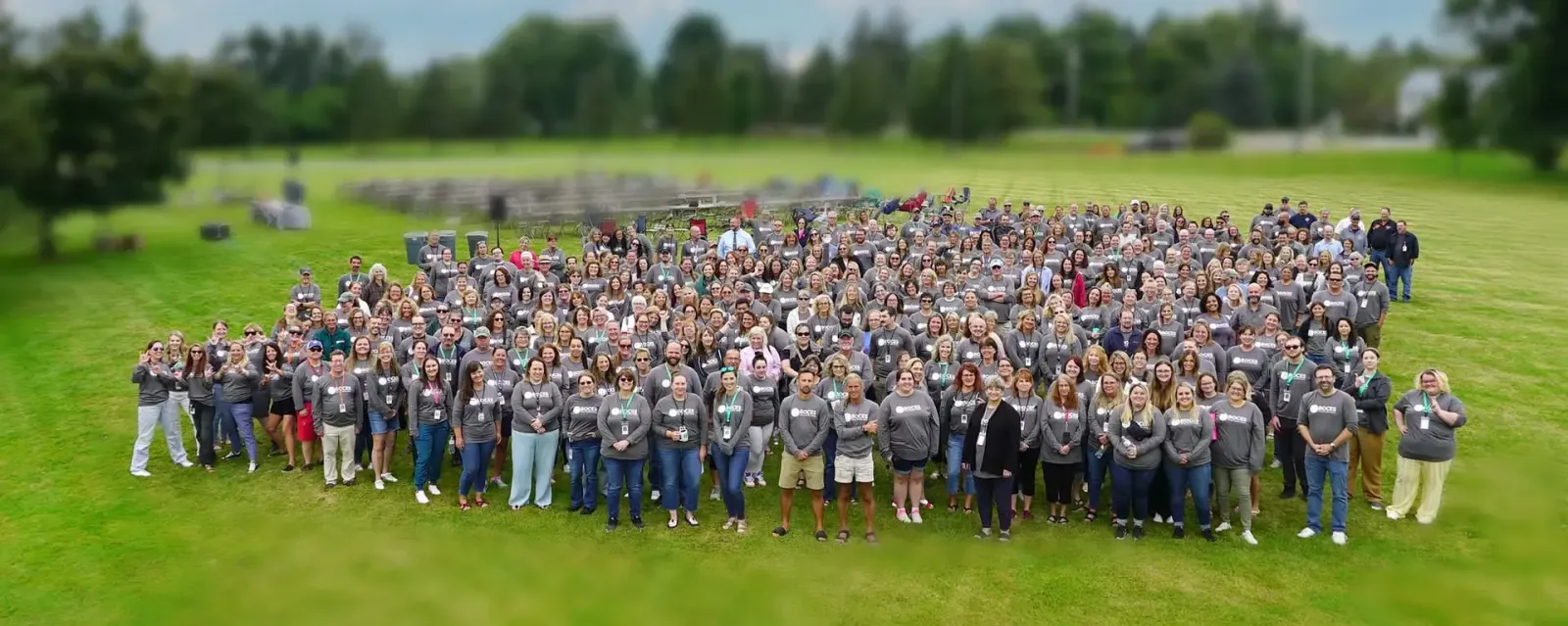
Jefferson BOCES is the school system behind the school systems of New York's North Country. Its component districts span five counties, many of them small and rural, and BOCES provides what they can't on their own: career and technical education, special education and related services, professional development, shared business services and adult education. More than 500 people carry that work across technical centers, classrooms and district offices.
That breadth was also the problem. Programs operated in isolation and presented themselves in their own ways, and nothing tied them together. Communities knew the technical centers and little else. Most never saw the social workers, speech therapists and shared services that small districts depend on. The public filled the gap with an old assumption: that BOCES was a trade school, or a place for students who weren't headed to college. The organization was trusted by the districts it served and misunderstood by nearly everyone else.
Inside, the experience depended on who picked up the phone. Staff took pride in being the first call a district made when it needed help, but expectations varied from department to department, and there was no shared way to describe the work. Budgets were set by the districts and the state, so BOCES couldn't spend its way to visibility.
In 2019, leadership set out to change that, and named customer service as the goal: every interaction, with a district, a family or a colleague, should reflect the same organization. That required something BOCES had never had, a brand 500 people could carry the same way.
Approach
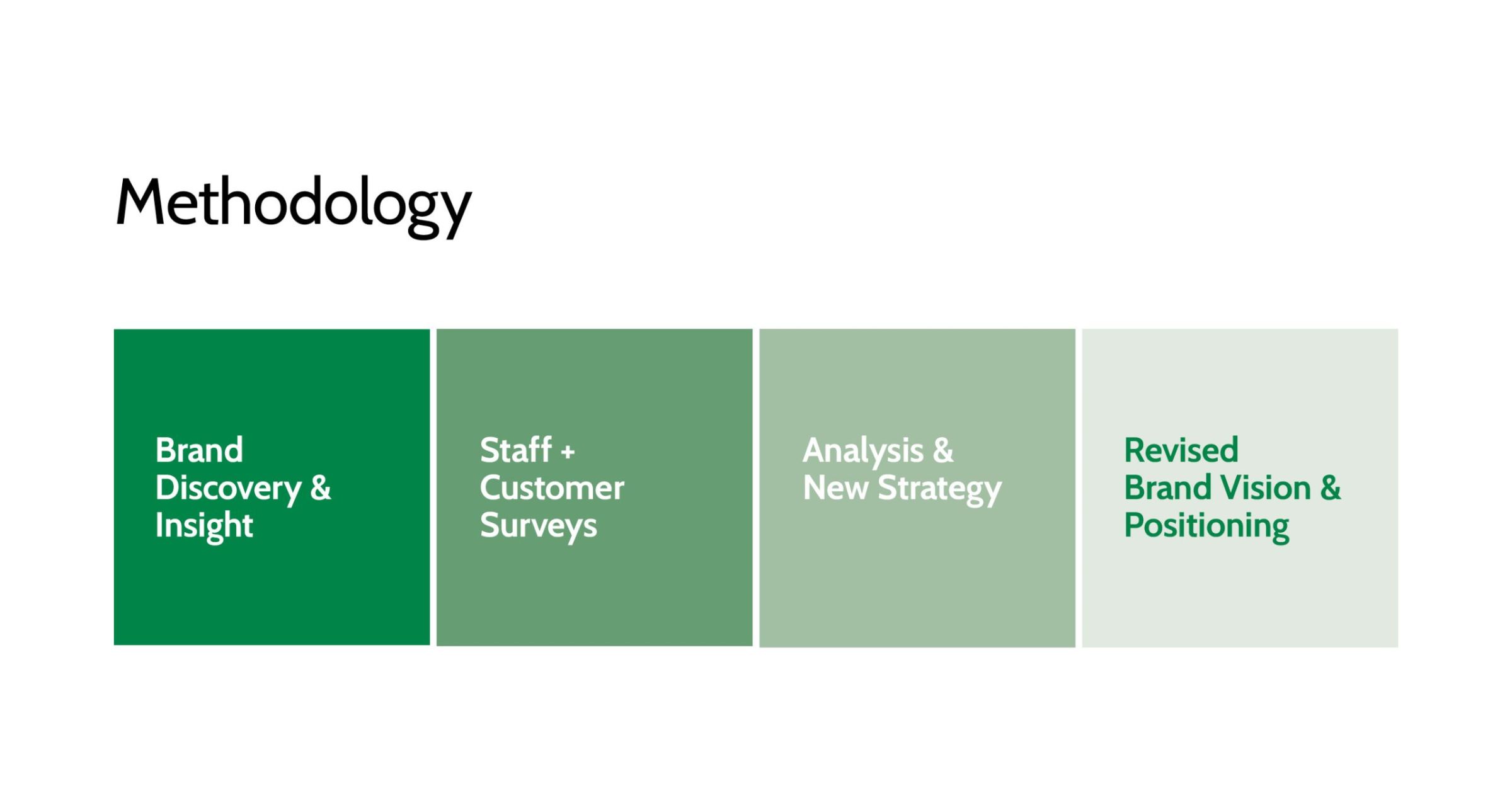
I co-led the engagement and worked directly with the Superintendent and leadership team. Before any design, we listened. Insight Sessions gathered 86 stakeholders: the management team, plus 70 partners including district administrators, principals, teachers, board members, alumni, employers, parents, students, and leaders in government, mental health and workforce development. Management, partners and the board each received their own report before seeing the whole.
The sessions confirmed that the service was real and the story was missing. More than 87% of partners described themselves as content, inspired or invigorated by BOCES, and 95% believed it was actively working to improve. Yet 40% of leaders named a lack of awareness of what BOCES is and does as its greatest weakness. More than two-thirds of respondents said brand communication and consistency were holding it back, and nearly a third of leaders said the leadership team wasn't pulling in the same direction.
The synthesis came down to two verbs: capitalize and correct. Capitalize on what already worked; leaders named staff as BOCES' greatest strength by a wide margin. Correct the inconsistency that kept that strength from reading as one organization. Staff defined customer service as trust, consistency and communication, and named consistency as the hardest part. If customer service was going to define the brand, it had to be something every employee could practice, not a slogan.
Brand Platform
We built from the inside out: promise, position, priorities, pillars, then personality. The promise: We transform education through leadership and empathy. The position: innovating education through a caring, community approach to the student experience.
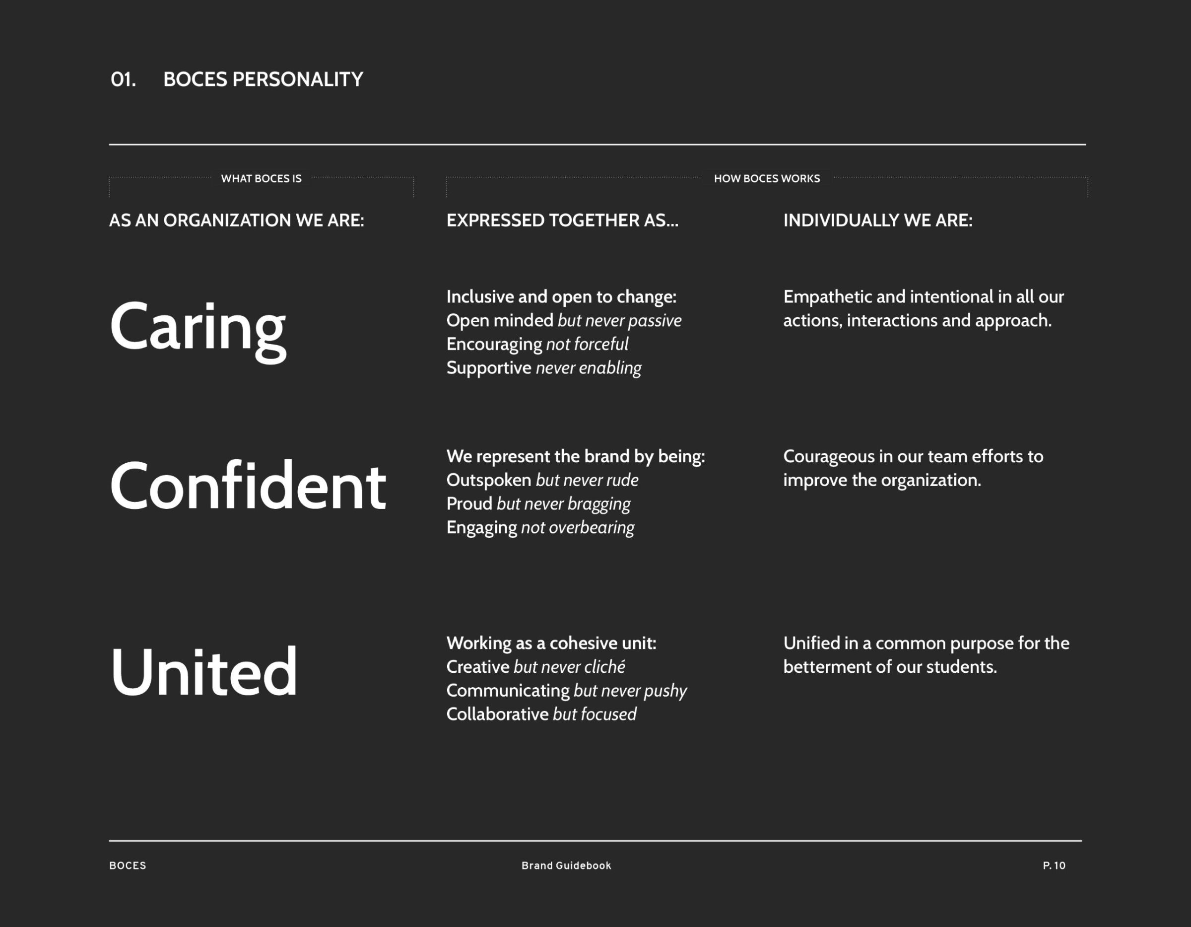
The personality carries the operational weight. Three traits, Caring. Confident. United., are each defined twice: what BOCES is as an organization, and how each person acts. Confident means outspoken but never rude, proud but never bragging. United means communicating but never pushy, collaborative but focused. Customer service stopped being an aspiration and became a standard any staff member could hold a phone call or a district meeting against.
Identity System
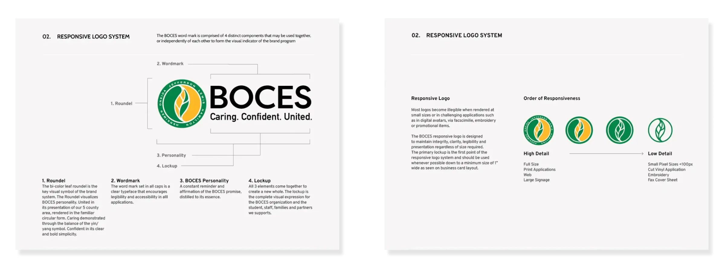
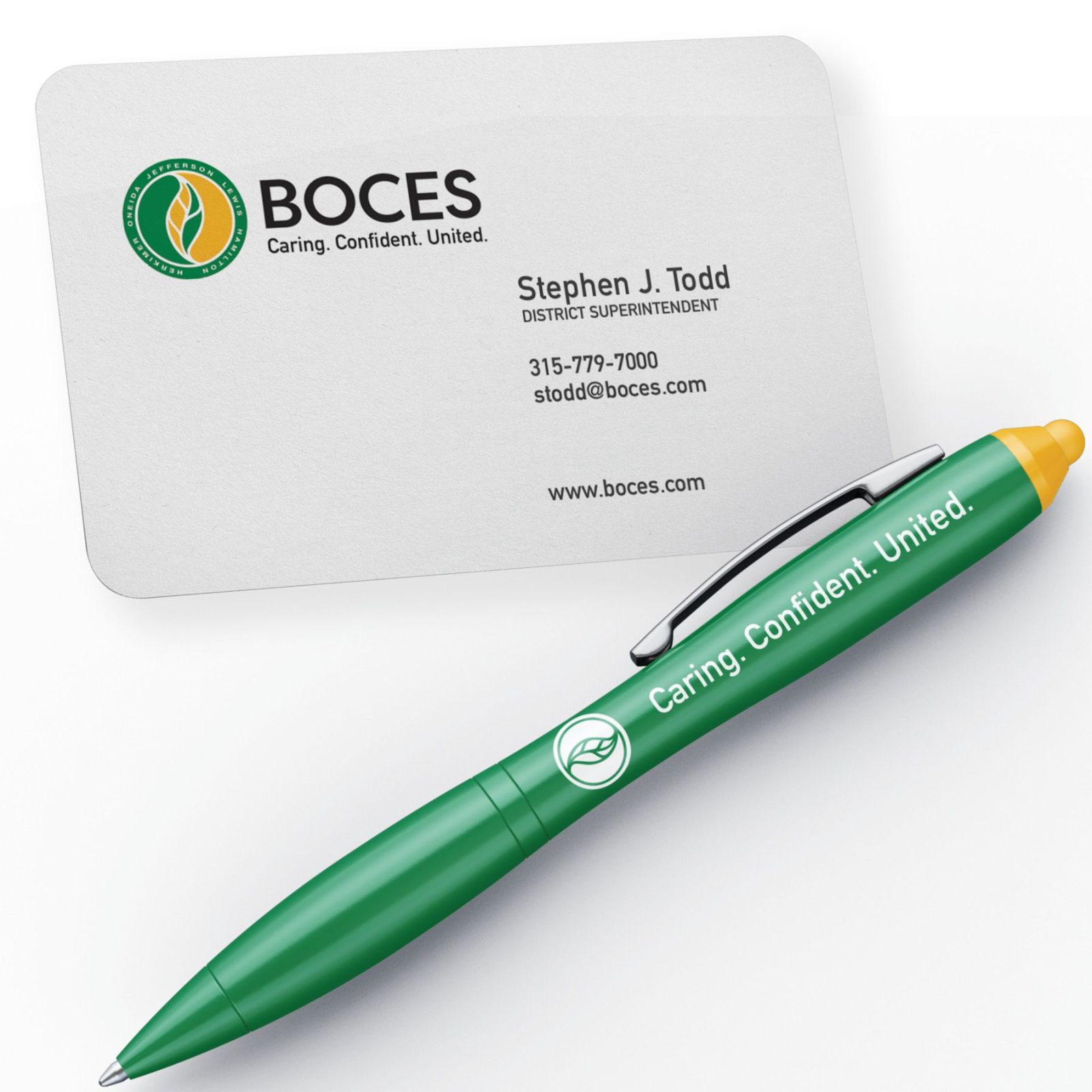
BOCES already had a mark with real equity: a circle for the completeness of education, the balance of a yin-yang, and five leaf segments for the five counties it serves. Replacing it would have spent decades of recognition to solve a problem the existing symbol didn't have. The problem was structure. So we kept the mark and gave it a system. We redrew the roundel, reset its typography, and paired it with a new type family that became BOCES' written voice. The result is a responsive set of four parts (roundel, wordmark, personality line and full lockup) that holds from building signage and fleet vehicles down to embroidery and a browser tab. Named colors such as Leaf, Gold and Granite, drawn from the region and the classroom, gave staff a shared vocabulary for every element they touch.
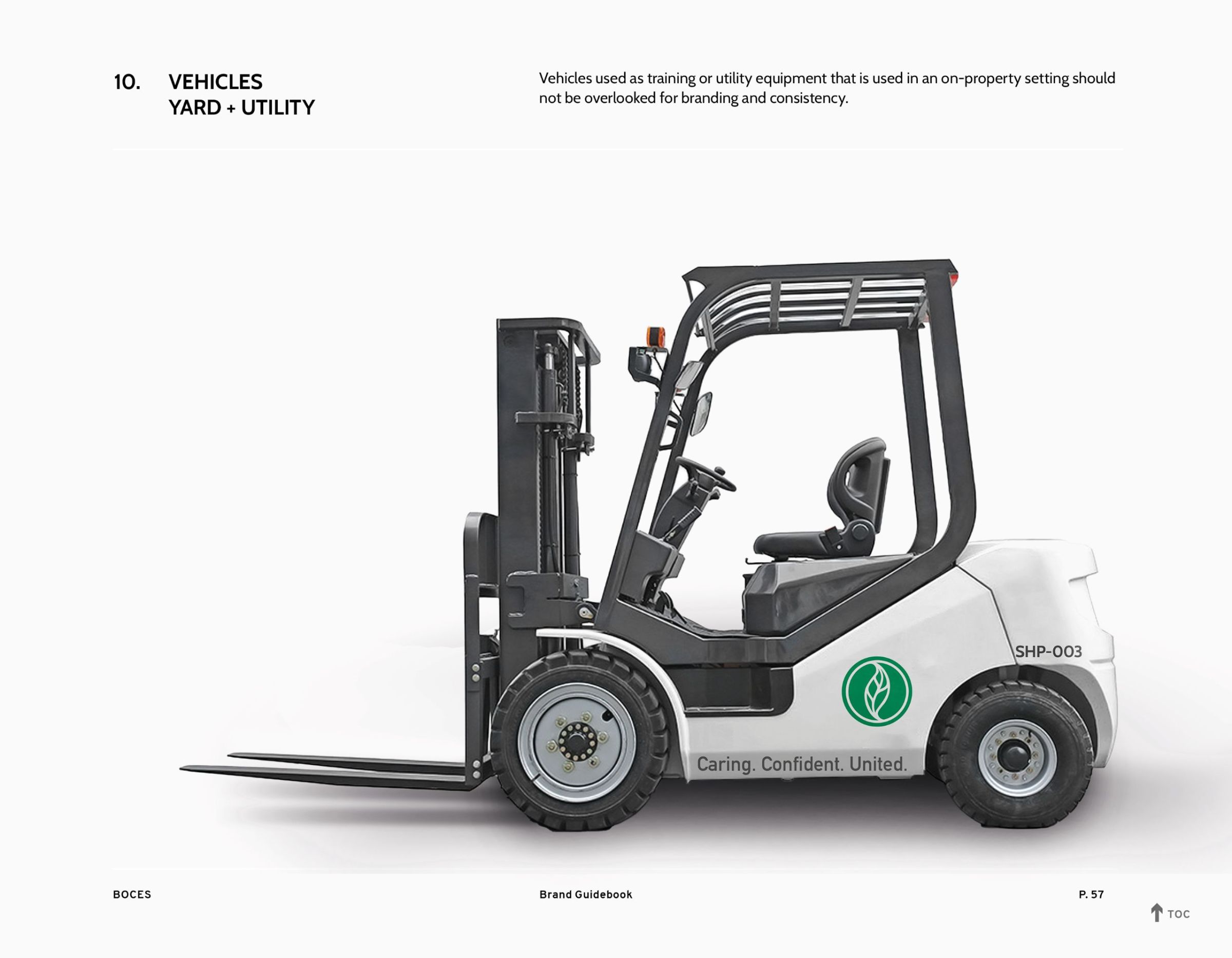
The guidebook makes consistency the default. It sets templates for program brochures, stationery, video, social, vehicles and signage, and it builds in a review cycle so the system evolves instead of drifting.
Outcome
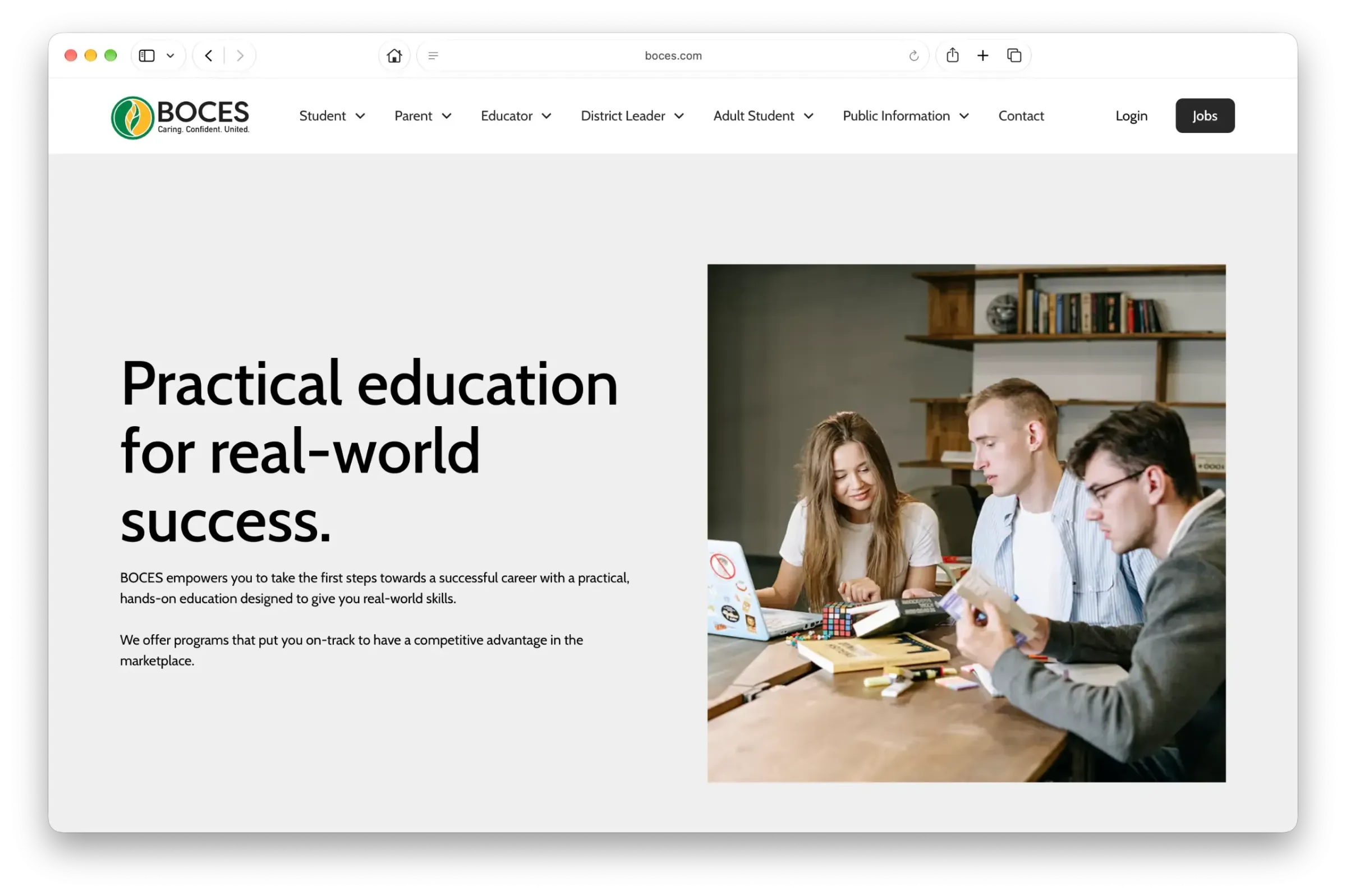
Jefferson BOCES adopted the system as the first organization-wide brand in its history. The Superintendent and leadership team championed it across a staff of more than 500. Since launch, the brand has been maintained and expanded: it now shapes how BOCES interviews, hires and onboards its people, and it carried into a major new website in 2025. The promise and the three traits lead the public brand page at boces.com/about/boces-brand, and Caring. Confident. United. heads the careers page.
The change shows up in how people talk about BOCES. Partners and staff report a clearer understanding of who BOCES is, and shared language for how to frame and discuss the work the organization does.
The brand didn't teach BOCES how to serve or what to do. It gave 500 people three words to be clear about how they do it.