
Opportunity
Seneca Federal had spent 80 years earning the trust of its depositors, who were concentrated in one profile: women in their late 40s to mid-60s with substantial savings. That base was loyal, and it was aging. Larger regional banks and credit unions were competing for the next generation.
The bank's fundamentals were strong: fair lending decisions, competitive rates and fast closings. Its presentation wasn't. Ads varied in quality and appearance, and each one was built around its own offer. None of them said anything about the bank, so a customer could see a dozen pieces of Seneca advertising and still not know what Seneca stood for.
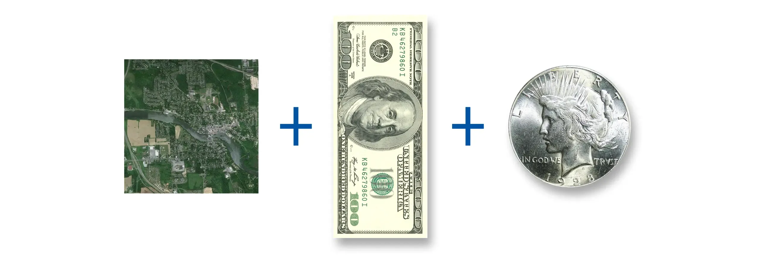
Meaning behind the mark: the river in the bank's founding village, the proportions of currency, the color of coinage.
Approach
I led four designers and worked directly with the bank’s executive team to establish the direction. I guided the development of advertising templates and an updated web presence, showing leadership how the identity would work across communications and customer settings before they committed.
The problem wasn't advertising. It was coherence: nothing the bank put out was accumulating. So the work began with one priority. Every communication would establish the institution first and sell the offer second: a trustworthy bank, built for modern banking.
Two criteria shaped every decision after that. The identity had to last 25 years or more. It also had to survive a name change. Early on, leadership indicated "Seneca Federal" would eventually be retired, so the identity was built into the mark rather than the word "Federal."
Identity System
The mark draws on the Seneca River, which winds through Baldwinsville, where the bank was founded. It is a sinuous S set on a field proportioned like U.S. currency, in blue for depth and stability and silver for coinage. Leadership reviewed it on stationery, building signage and the website before committing.
The standards released in 2012 made consistency the default. They set approved names, ad layouts and image rules, plus a small set of recurring elements any staff member or vendor could use. Any product could carry its own offer and still read as the same bank.


Outcome
In July 2014, the bank became Seneca Savings and changed its name without rebuilding its identity. In 2015, a new agency extended the system into a broad regional advertising program for print and television.
The bank kept growing into the system. Since the name change, Seneca has gone from a three-office mutual thrift to a publicly traded national bank with five branches. Total assets grew from $130.3 million at year-end 2014 to $312.4 million by June 2026. The system carried through a CEO succession, two stock offerings and a charter conversion. The brand designed in 2008 for a three location bank is still intact across a growing network. Seneca Savings opened in Manlius in 2025, built on the same identity system.
The identity didn't grow the bank. It gave the bank something that could grow into and evolve without being rebuilt.
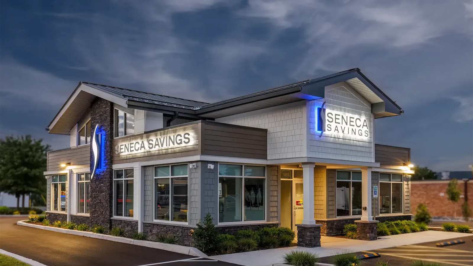
Branch image courtesy of Everet D. Regal - eRegal Studio